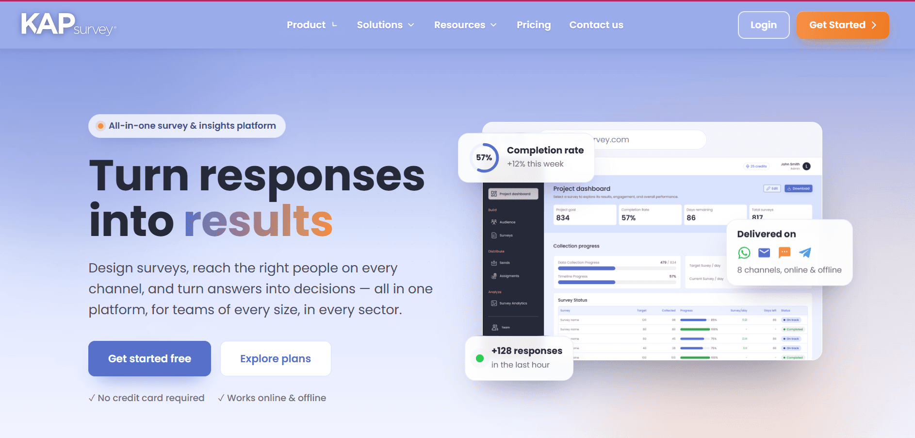
If you've used KAPsurvey to collect data in the field, manage a KAP study, or run analysis for your program, you know how much the little details matter a page that loads a beat too slow, a menu that's hard to find, a pricing page that leaves you guessing. We heard you, and we've spent the last few months rebuilding key parts of the KAPsurvey experience from the ground up.
Today, we're excited to introduce KAPsurvey 2.0 a refreshed platform experience built to feel smoother, faster, and more intuitive from the moment you land on our site.
Here's everything that's new.
✨ A Homepage That Works as Hard as You Do
The first thing you'll notice is the homepage. We've given it a modern redesign with smooth animations that make navigating KAPsurvey feel like a genuinely new experience. Whether you're a first-time visitor trying to understand what KAPsurvey does, or a returning user looking for a specific feature, the new homepage is built to get you where you need to go faster and with less friction.
📱 A Better Experience On the Go
Field research doesn't happen at a desk, and your tools shouldn't assume it does. We've rolled out improvements across the board on mobile, so whether you're checking in on a survey from your phone between site visits or reviewing dashboards on a tablet, KAPsurvey now feels just as reliable on the go as it does on desktop.
💰 A Pricing Page You Can Actually Use
Finding the right plan shouldn't require a spreadsheet and a phone call. Our redesigned pricing page is cleaner and clearer, making it easier than ever to compare options and land on the plan that actually fits your team's needs whether you're a small NGO piloting your first KAP survey or a larger organization running studies across multiple regions.
📩 Contact Us, Reimagined
Reaching out to our team should be effortless now it is. The new Contact Us page features a fresh, modern design with smooth animations, so getting your questions to the right person takes just a few clicks.
🧭 A Sleeker Way to Navigate
Rounding out the update is a brand-new top menu. It's sleeker, more intuitive, and designed to make moving across the platform from your dashboard to your survey tools to your account settings, quicker and more natural.
Why This Matters for You
These updates aren't just cosmetic. For the NGOs, M&E professionals, health program managers, and field research teams who rely on KAPsurvey every day, a faster and more intuitive platform means less time fighting the tool and more time focused on what matters: designing better surveys, collecting cleaner data, and turning numbers into narratives that drive real decisions.
Try It Today
KAPsurvey 2.0 is live now. Log in and explore the new homepage, take the redesigned platform for a spin on your phone, or head straight to our new pricing page to find the plan that's right for you.
Have questions or feedback on the new experience? We'd love to hear from you reach out through our reimagined Contact Us page