Turn responses into insight
Where results are reviewed and understood. Explore data as it arrives, build the dashboards you need, and act on the answers that matter — in real time.
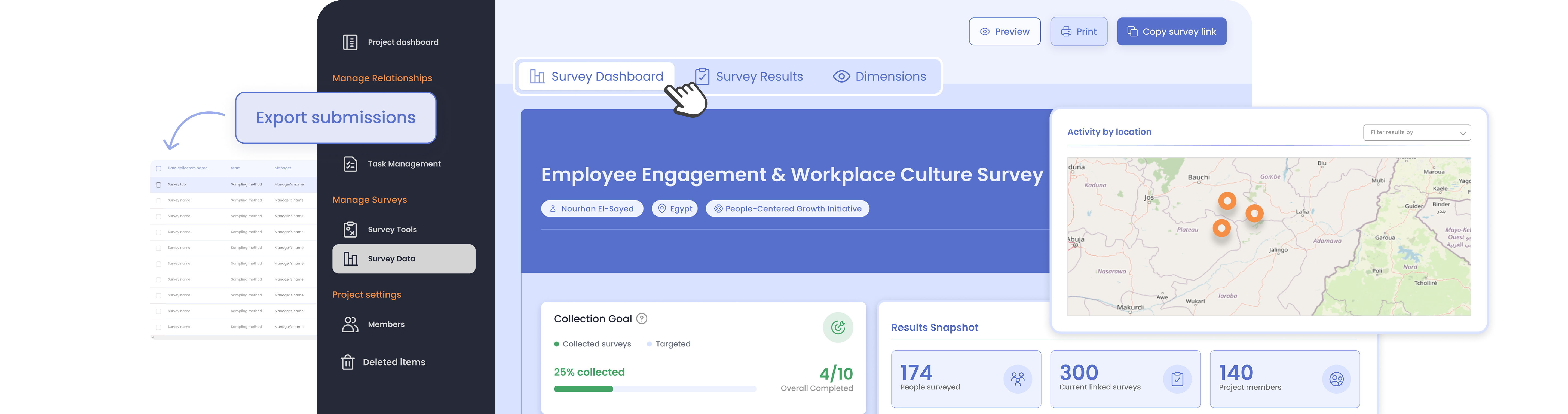

Where results are reviewed and understood
From the first response onward, KAPsurvey turns raw data into clear, shareable insight — with everything exportable to PDF or your favorite BI tool.
Survey analytics, rebuilt
Every survey opens on a redesigned analytics workspace with four tabs — and everything is exportable to PDF.
- Survey dashboard: KPI cards, a plain-language pace message and a cumulative-vs-target collection timeline.
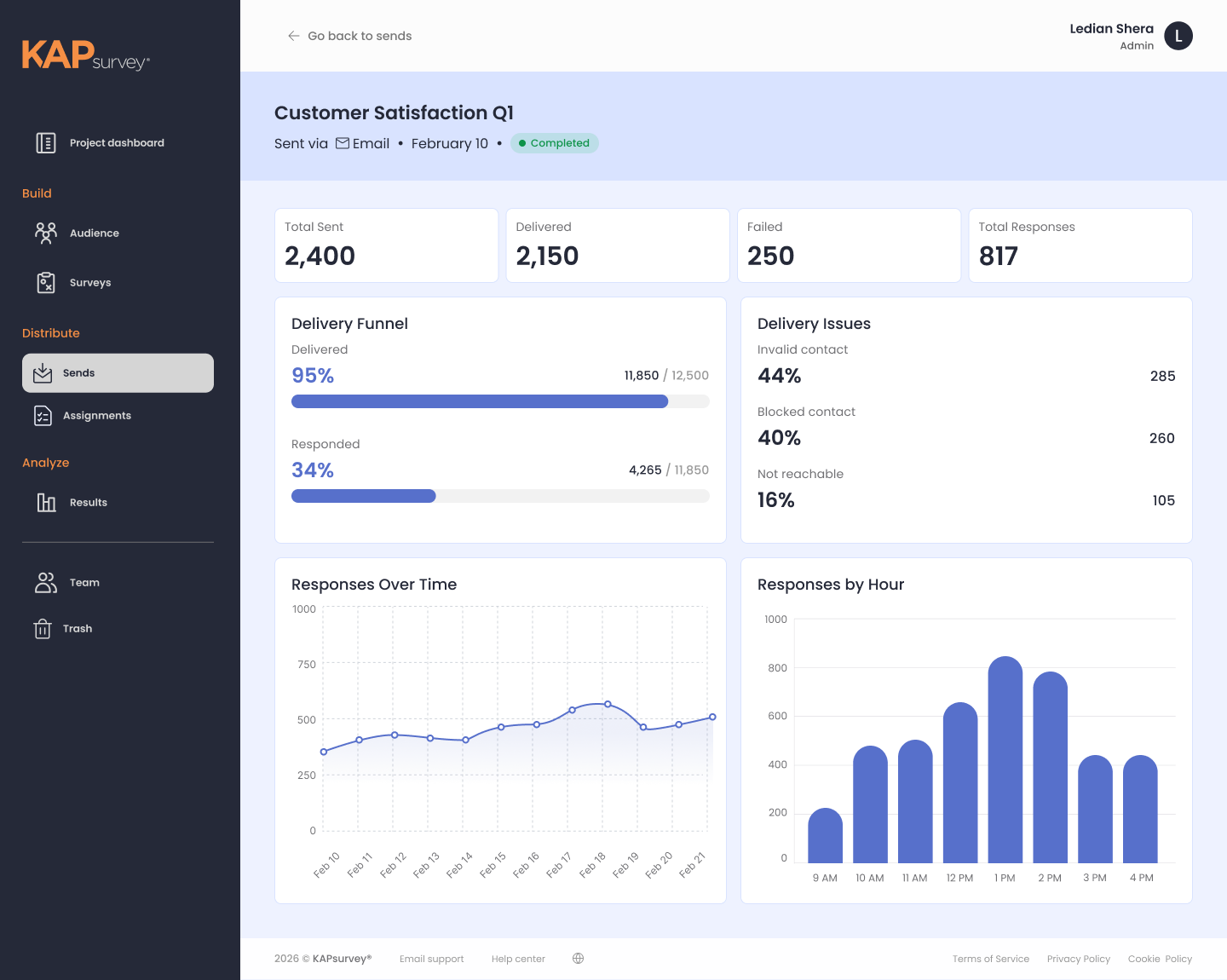
- Responses by method: Break results down by campaigns, team assignments and link channels — with per-channel credits and response rates.
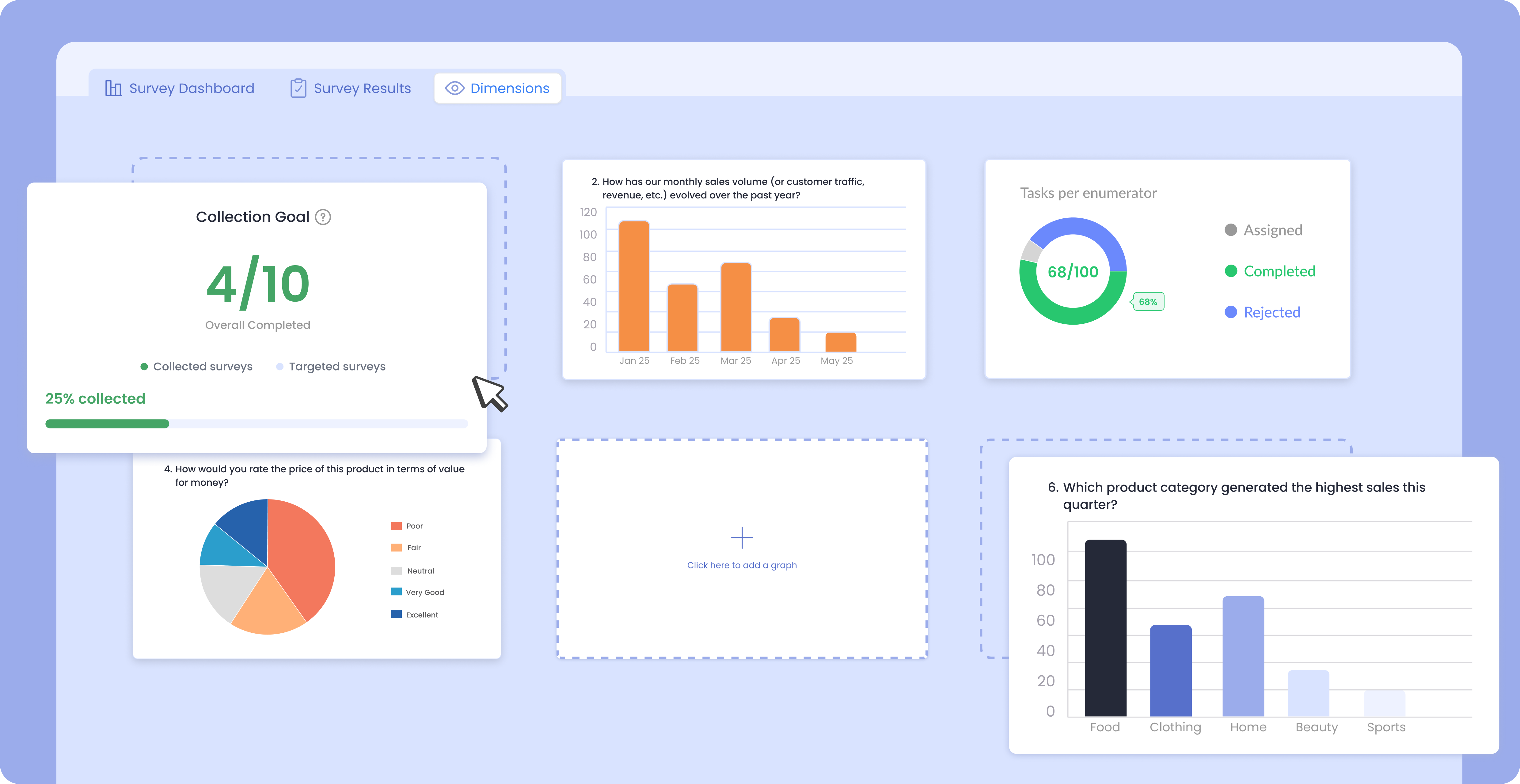
- Results, Insights & Highlights: Per-question graphs, custom dimension charts (column, pie, line, heatmap) and pinned submissions.
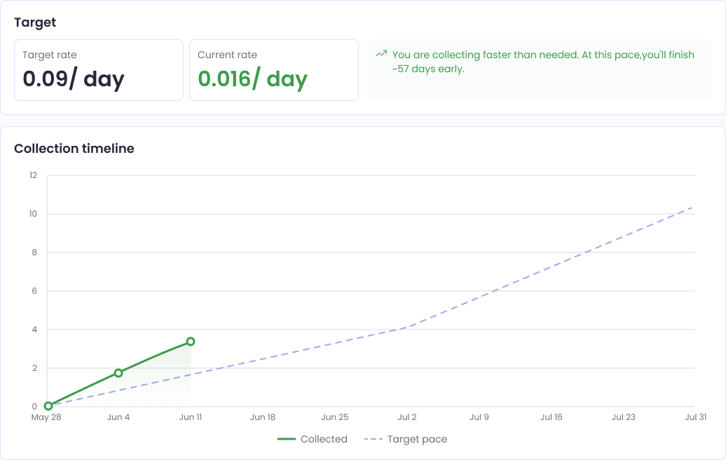
Survey Dashboard
Every published survey gets its own dashboard, so you always know where things stand.
- Collection timeline: Chart progress against your target pace as responses arrive.
- Responses by method: Break results down by campaigns, assignments, or links — single-use, multi-use, or kiosk.
- Live response map: See where responses are coming from, in real time.
Survey Results
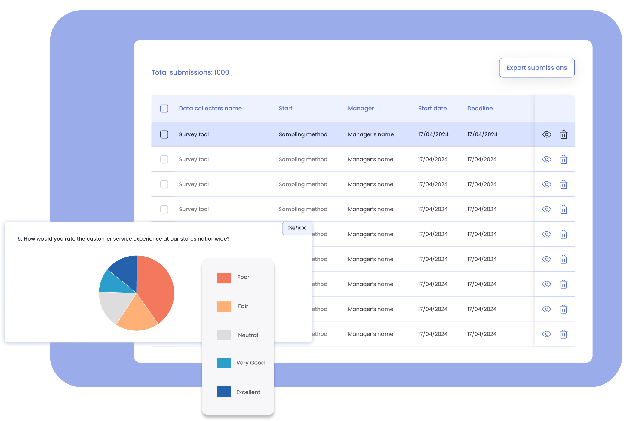
Review results question by question, with response and non-response rates broken out for each one.
- Graphs or table view: Explore each question visually or in a structured table.
- Export & integrate: Download results — with attachments — for offline analysis, or connect directly to Power BI and Google Data Studio to build on your data your own way.
Insights (360° Dashboard)
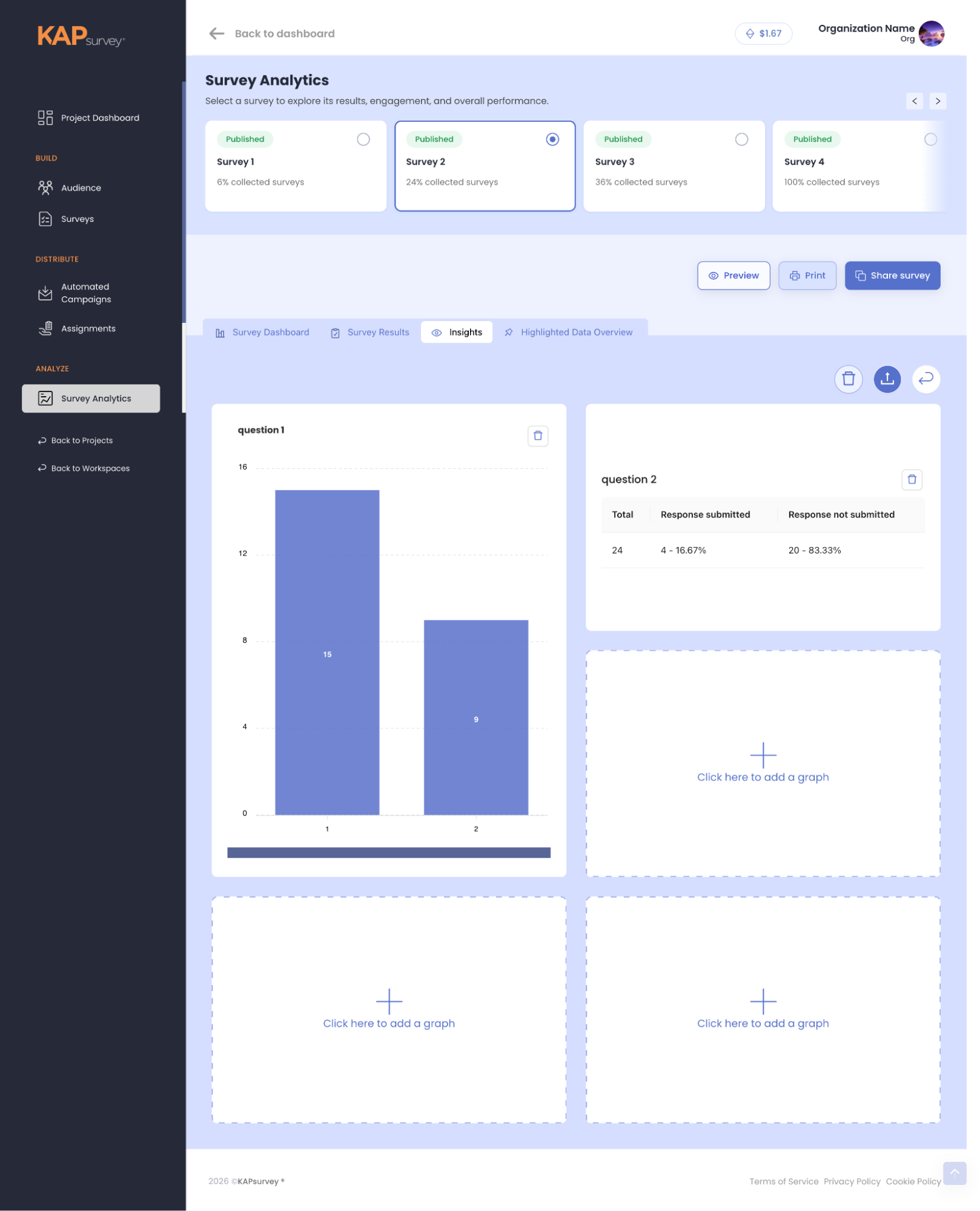
Build your own custom dashboard, graph by graph, exactly the way you want to explore your data.
- Your data, your way: Column, pie, line, and heatmap charts across any dimension you choose.
- Fully shareable: Every view is shareable and downloadable, so your team and stakeholders see the same 360° picture, wherever they are.
Highlighted Data Overview
Set conditions on the answers that matter most, and get an automatic alert the moment they come in.
- Act immediately: A supply level dropping below threshold, an applicant matching your requirements, or any other response worth acting on right away.
- Preview what counts: See the responses that matter without waiting to comb through the full dataset.
Key benefits


Smarter Decision Making
Make data-driven decisions with confidence based on clear, real-time insights.

Enhanced Efficiency
Streamline operations and optimize workflows with real-time monitoring and reporting.
Increased Impact
Measure the effectiveness of your initiatives and adapt your strategies for greater impact.

Better Communication
Share compelling visualizations and reports to effectively communicate findings.
Competitive Comparison
Real-time Dashboards
KAPsurvey offers real-time dashboards for both data collection and task allocation progress, a feature not commonly found in competitors.

Interactive Dimensions Dashboard
Our Dimensions dashboard provides a more interactive and user-friendly experience for analyzing data across various dimensions.

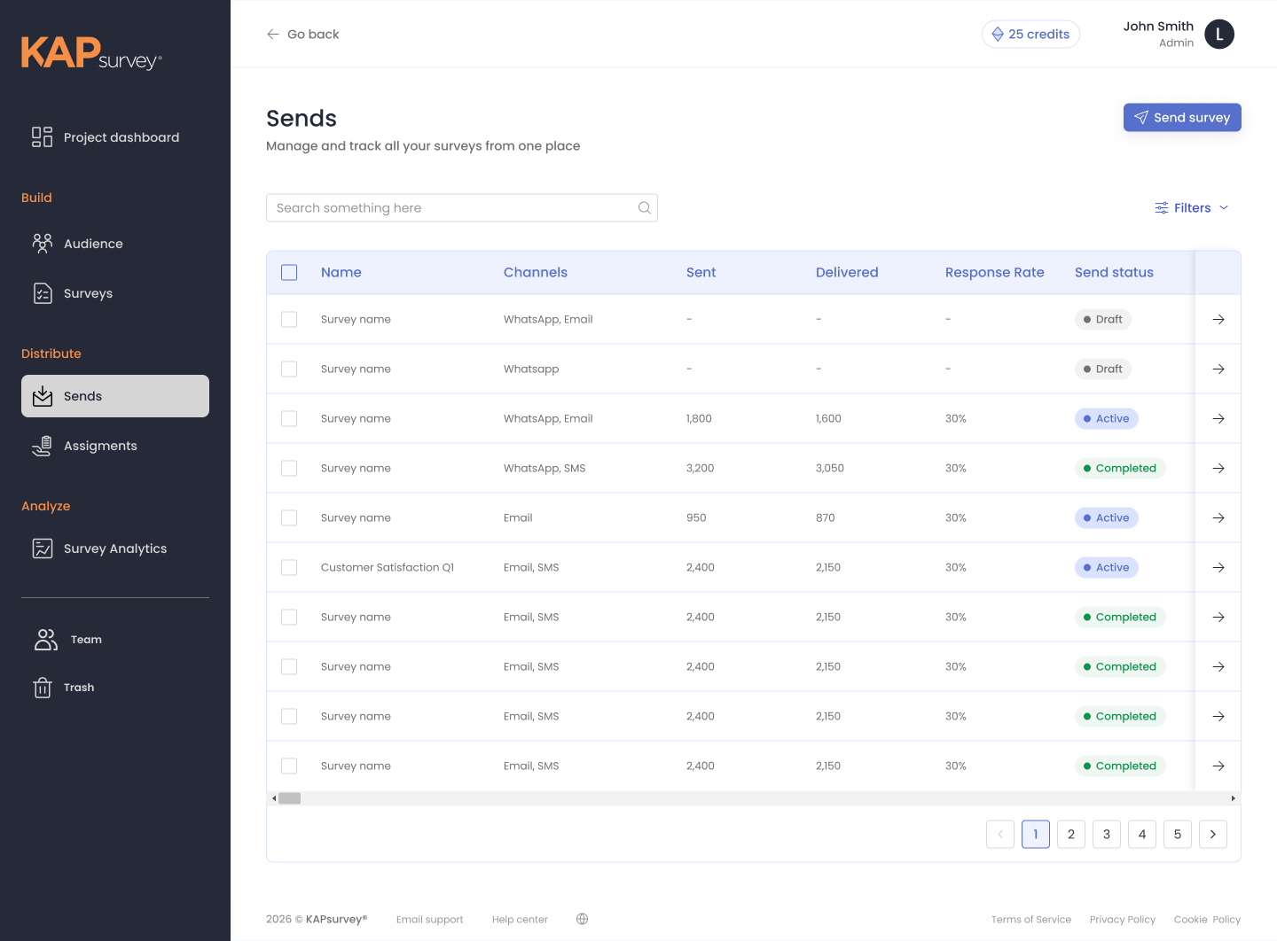
Integrated Audience & Campaigns
KAPsurvey's built-in Audience CRM and automated campaigns set it apart from basic survey builders — every progress number, from a single send to the project dashboard, is drawn from the same data.